
Whenever you run a file in OSCADY PRO, the Summary Results screen is updated. A grid of results is shown where each row represents a signal sequence, and the three columns represent each of the three optimiser objectives: critical cycle time, maximised capacity and minimised delay.
For a given signal sequence, the optimiser can adjust individual phase timings so that they give the shortest possible cycle time, or maximise capacity, or minimise delay at the junction. These are the three optimiser objectives.
As an example, in the MINIMUM DELAY screenshot, the highlighted grid cell (in yellow) is for the minimised delay column for Sequence 3. The number (12.30) is the minimised rate of delay, in units of PCUs, for Sequence 3. (See the User Guide for full details of units.) For the same sequence, the maximum possible capacity is 33.87%, and the shortest possible cycle time that is within capacity is 64s.
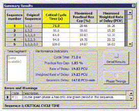
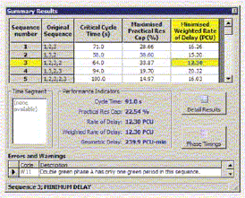
Other sequences may perform better or worse, in terms of delay, or capacity. OSCADY PRO highlights in blue the ‘best’ sequence for each objective. In the screenshot, Sequence 2 gives the smallest cycle time and the highest capacity, but Sequence 3 gives the lowest junction delay.
The grid cell highlighted in yellow is known as the Active Sequence/Objective, or the active solution. So if, in the MINIMUM DELAY sreenshot example, you now click on the buttons to show phase timings diagrams or detailed results tables, all the data will refer to the results for the minimised delay solution for Sequence 3. If you click in a different cell, then all other results screens will auto-matically update to reflect the results for this new solution. You can only view one solution at a time. All solutions are generated with each run of the file; the Summary Results screen lets you examine each of them.
Whichever row and column you click on, the Performance Indicators in the centre of the screen always show the cycle time, PRC and delay for the highlighted solution.
When you run a file for the first time, the active solution always resets to its ‘default’ position at the top-left, so that the Critical Cycle Time solution for Sequence 1 is always highlighted – as shown in the CRITICAL CYCLE TIME screenshot. This is unlikely to be the solution you are interested in; therefore you should always remember to click within the grid to make sure you have selected the sequence and objective of interest.
If you run a file whilst the Summary Results screen is already displayed, then the active solution will stay the same. E.g. if you highlight Sequence 3, Minimum Delay, then make a change to traffic flows and re-run the file, all results screens will still show results for Sequence 3, Minimum Delay.
An obvious question is: why can’t the Summary Results screen automatically jump to and highlight the best solution? The answer is that it could, but that it may not always be possible to define what is meant by ‘best’. In addition, allowing the program to automatically select solutions could be confusing when you are trying to study the effect of changes on a given solution. However, we will look at an implementation of this idea for future versions of the program.